Lot 106
HARLAND MILLER (BRITISH 1964-) §
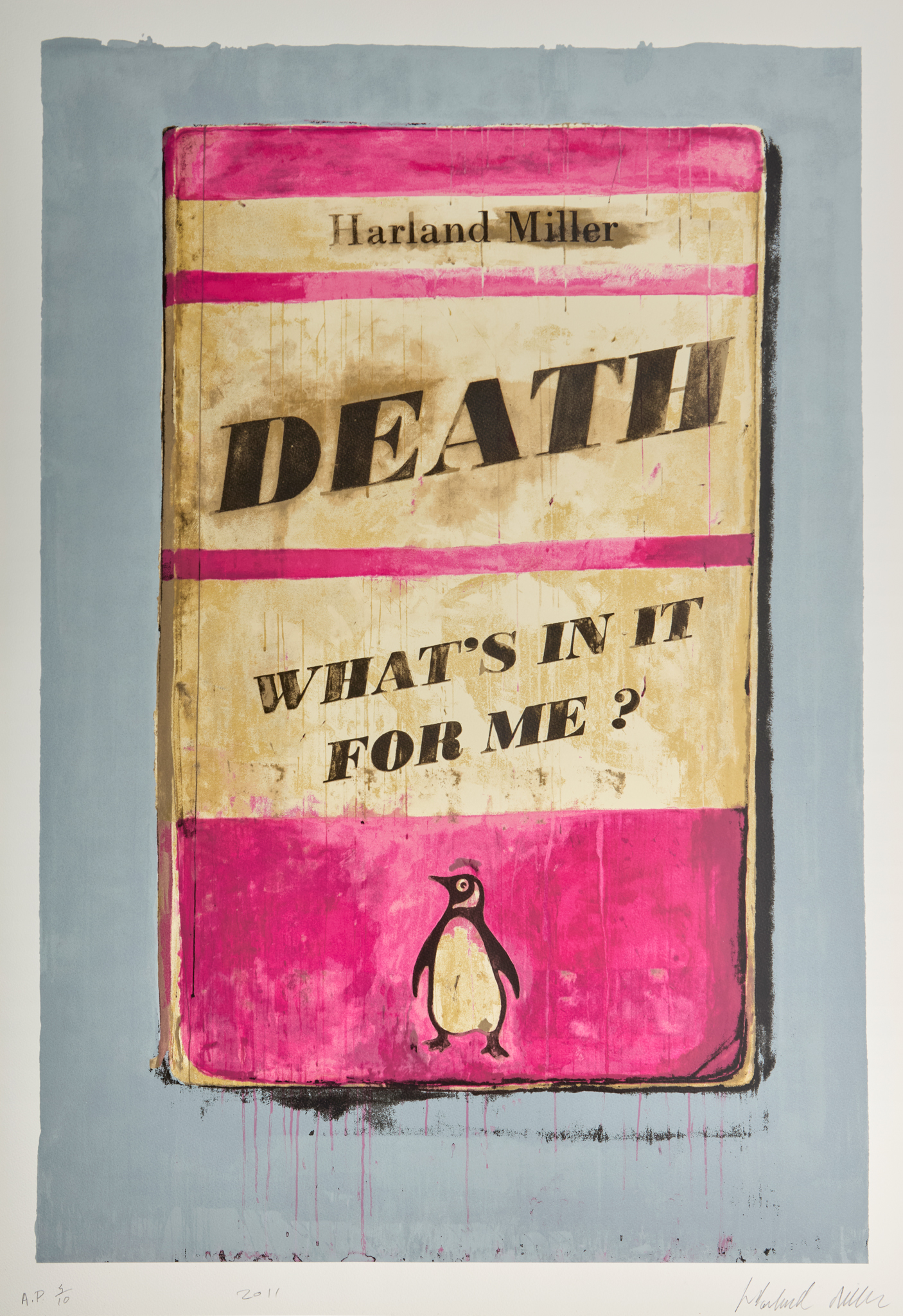
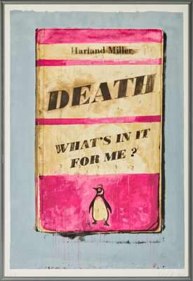
DEATH, WHAT'S IN IT FOR ME?

Auction: 13 October 2026 from 13:00 BST
Description
screenprint in colours, 2011, signed in pencil, dated, numbered A.P 5/10 (an artist's proof aside from the edition of 50), published by White Cube, London, on Somerset wove paper, framed
Dimensions
image: 89cm x 59.5cm (35in x 23 3/8in)
sheet: 95.8cm x 65.8cm (37 3/4in x 25 7/8in)
Footnote
Harland Miller’s DEATH: WHAT’S IN IT FOR ME? comes from the artist-writer’s practice-defining series of images based on the dust jackets of Penguin Books publications. Born in Yorkshire and trained at Chelsea School of Art in London, Miller here combines the literary with the visual, with references to the histories of both forms of creativity. The roots of the composition in the present work are those of the publisher Allen Lane wishing to produce inexpensive paperback editions of high-quality books in the 1930s, with a typography and cover design mainly defined by Jan Tschichold in the 1940s. The result was one of the most successful, long lasting and influential examples of twentieth-century branding.
The inclusion, placement and presentation of his name in DEATH, WHAT’S IN IT FOR ME? is both a play on an artist’s signature as traditionally placed on the face of a work of art, as well as the declaration of an author’s identity. As a result, Miller presents himself at once as artist and author. Notions of typographical symbolism are further explored in the screenprint-book’s title and sub-title. They are presented in distinct visual fields on a diagonal, introducing an element of dynamism and even flippancy to a fundamental question of human existence.
Going beyond the palette used by Penguin Books to signify genres, namely orange for fiction, green for crime and blue for biography, Miller uses an uneven pink as the principal colour in his image. This alludes not only to Colour Field painting, but by way of its suggestion of fading, contributes to a sense of a time, use, wear, age and readers of the past. A connection with viewers is thus established, who may have their own memories of reading Penguin Books publications.
Miller conducts a vertical literary and visual rhythm through the screenprint, with counterpoint climaxes of DEATH and the appropriated penguin logo at the lower centre. DEATH: WHAT’S IN IT FOR ME? subverts the familiar and poses a serious question amidst cross-cultural references, nostalgia and an infusion of sardonic humour.